Learning Hub
for Career Advancement
The Problem
Employees struggled to navigate the company’s L & D platform.
The Client
Wells Fargo
My Role
I researched, redesigned and delivered a clickable prototype that re-imagined the user experience using gamification elements
Tools Used
Figma
Adobe Illustrator
Process
1 Research
Competitive Analysis
Observations
2 Analysis
Site Map
Role Archetypes
3 Design
Lo-Fidelity Wireframes
Hi-Fidelity Wireframes
Clickable Prototype
4 Feedback
Usability Testing
Survey
5 Conclusion
Summary
Next Steps
Research
Comparative Analysis
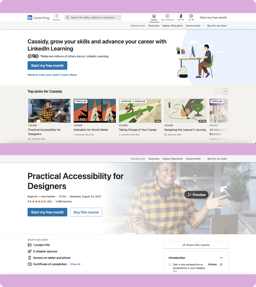
We began our research by visiting several successful L&D sites and conducting an informal comparative analysis of their information architecture and the sites’ key features. The sites that I compared include LinkedIn Learning, YouTube, Coursera, and Udemy. Understanding key components within these sites would ultimately allow our team to create a design solution that would leverage successful eLearning norms within the L&D space while saving time. I specifically analyzed each site’s landing page and learning dashboard, which are featured below.


Observations
Landing Page Key Items
LinkedIn Learning has a customized landing page targeting top picks for the user.
Youtube utilizes the search function at the top of the page and features horizontal screen space for an intuitive learning experience.
Coursera highlights the ability to advance your career’s level through means of education, providing a strong incentive.
Udemy also highlights the linear progression of career advacement and provides suggested recommendations.
Learning Dashboard Key Items
LinkedIn Learning allows the user to preview and review course outlines and highlights prior to beginning the lesson.
Youtube displays the visual list of videos to learn in the playlist to the right of the featured item creating an intuitive experience.
Coursera highlights specific skills the user will gain and emphasizes the final certificate as an incentive.
Udemy provides course ratings and specific content sections to provide the user with an optimal experience.
Analysis
Site Map
I led our team through a site map activity brainstorm in order to better identify the information architecture goals influenced by the secondary research, prior to building out the wireframes.

Role Archetypes
We collaborated with our client and consulted several internal employees who would be using the site to create three key role archetypes for target users. I chose to create role archetypes as opposed to user personas because role archetypes are a bit more general and represent the defining behavior or attitude characteristics instead of displaying a false name, bio, and photo as do personas. The three cards below outline the career progression from exception reviewer to supervisor.
1. Exception Reviewer Role
The first tier of document viewer reviews the highest volume of documentation. This role answers a lot of binary “yes” or “no” questions and when the documents get more confusing in nature, the exception reviewer will raise the document to the next tiered level.

2. Specialty Reviewer Role
The second tiered position reviews the documents that the exception reviewer has raised. This role requires more critical thinking and depth of knowledge than the first position. When this reviewer does not know how to sort the document properly, they raise it to the supervisor role.

3. Supervisor Role
This person supervises the other two roles and additionally checks documents that have been raised by the Specialty Reviewer. This role requires the greatest amount of experience and understanding in addition to exemplary people skills.

Design
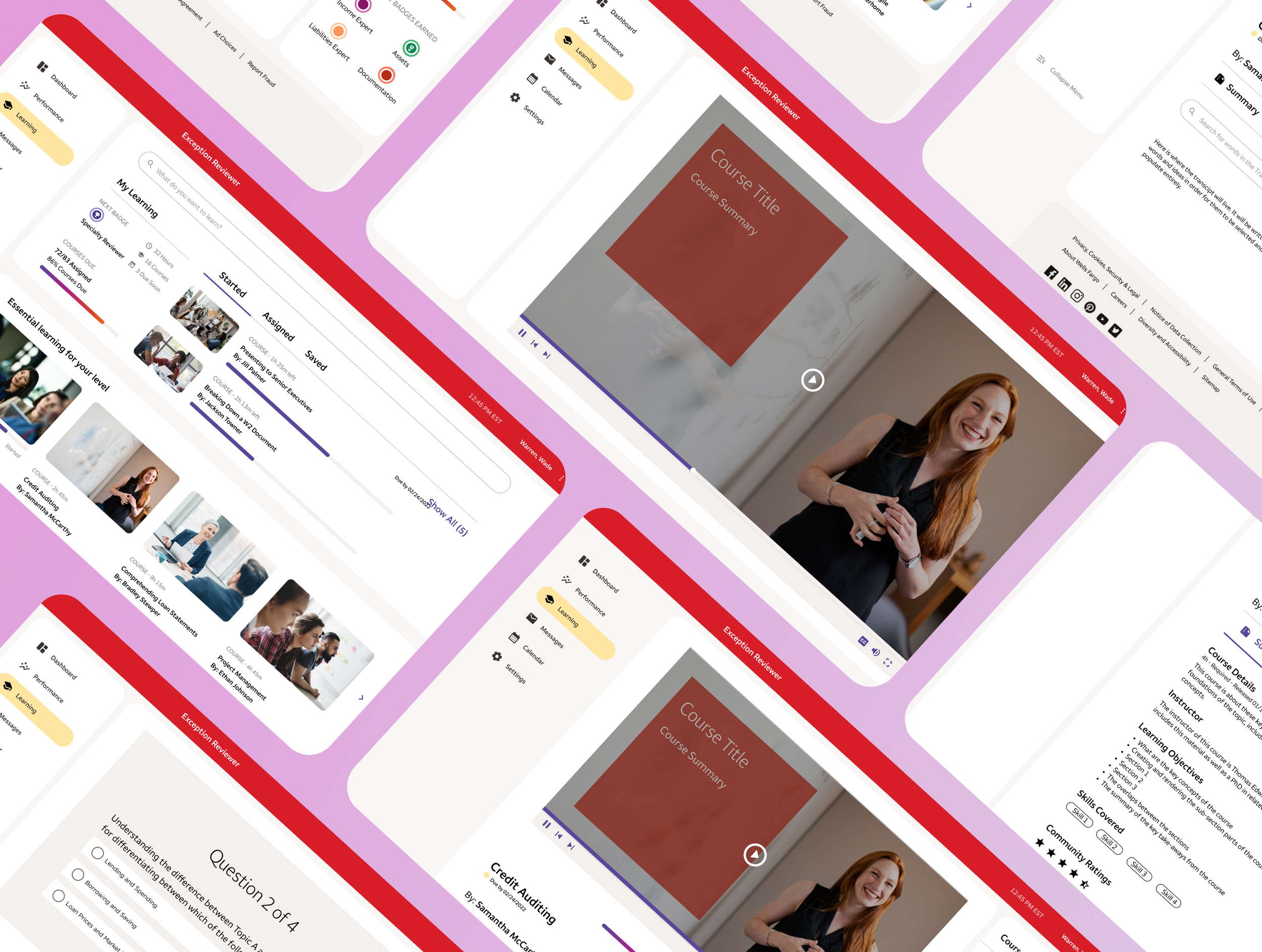
Low-fidelity Wireframes
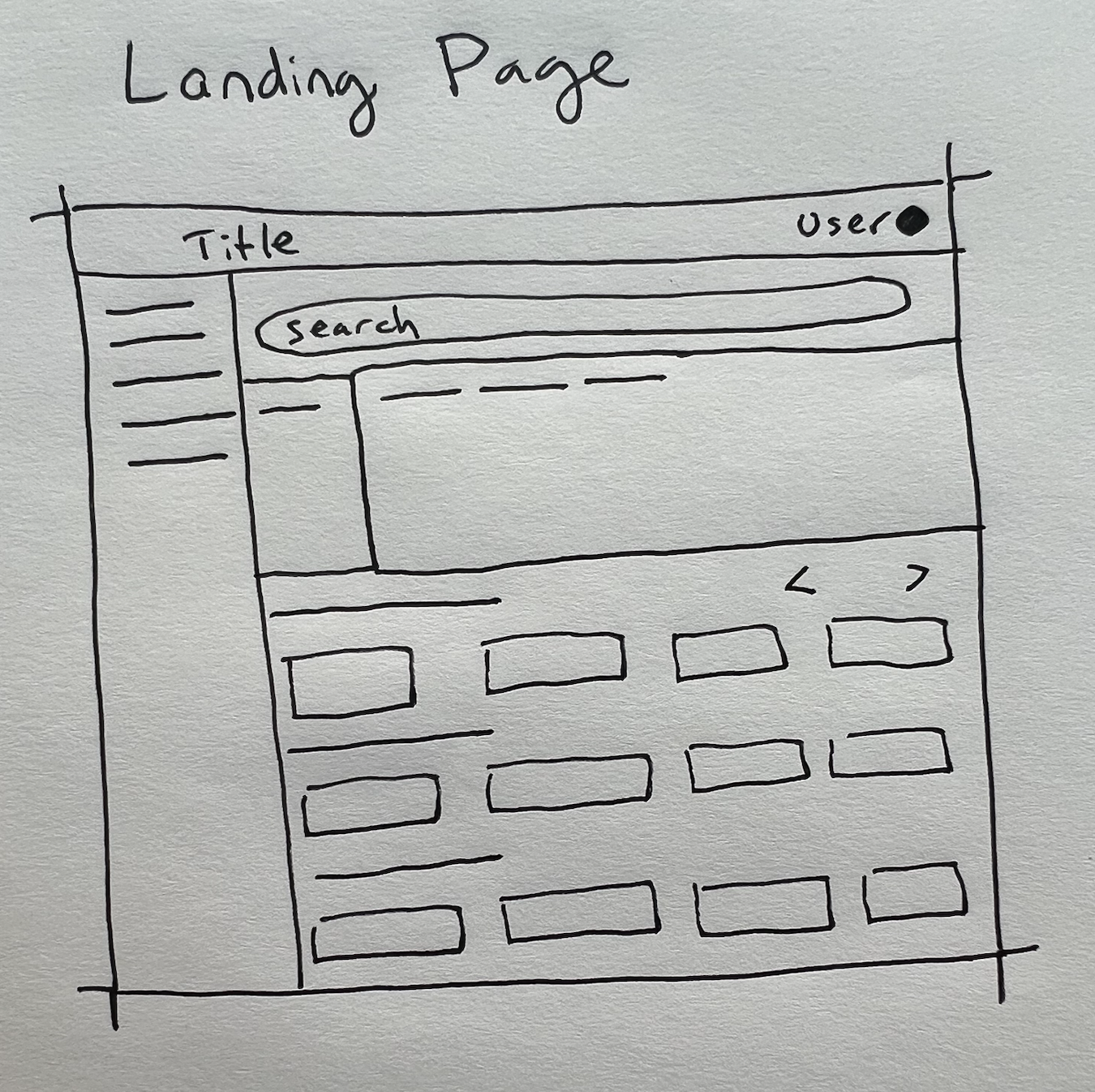
Ideating quickly with sketches prior to creating high-fidelity wireframes is essential in terms of brainstorming prior to creating the pixel-perfect and time-consuming high-fidelity user experience.

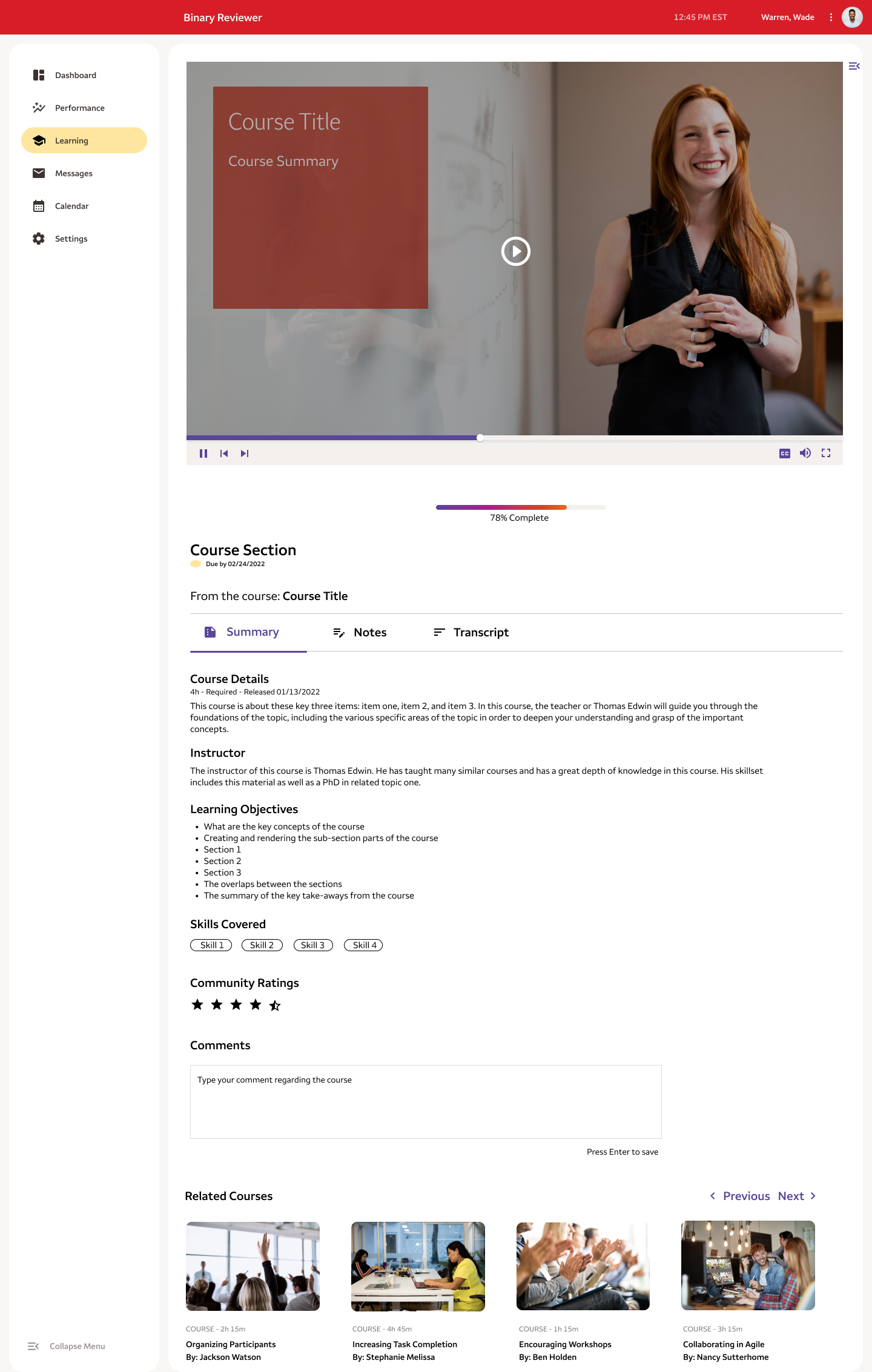
High-fidelity Wireframes
Based on our research we designed a customized user experience that leveraged elements from our research, site map, and role archetypes. The flow I created guides the user through the landing page to the learning dashboard and delivers an experience that incorporates gamification elements as well as formative learning assessments.

Gamification Badges
These badges I designed provide learning incentives and help motivate the learners to progress in their learning modules and roles. After completing enough courses in a playlist and earning the right badges, the user can progress in terms of their career level abilities in a very transparent way.


Landing Page
The landing page functions as the starting point when accessing the site. It leverages various elements and components from the comparative analysis of the other L&D sites discussed above.
Learning Dashboard
The learning dashboard also leverages items such as the gamification, the horizontal video view and the linear role progression from the comparative analysis above.
Clickable Prototype
Feedback
User Testing
We conducted one round of user testing using the prototype MVP to gauge the target user’s responses and compare their responses to the original L&D site.
Semantic Color Organization
I had my team use intuitive colors in terms of breaking down the data we gathered from the user interviews. Each quote from the interview was sorted in order to better understand each user's reactions.


Survey Post Test
Did you find the website easy to navigate?
Did you find the learning dashboard gamification elements useful?
Did you find the site navigation intuitive?
Did you enjoy the formative assessment on the website?
Negative
2/6 users expressed wanting there to be an interactive component such as a chat feature. They said this would help them hold their colleagues accountable.
1/6 users users were confused about the purpose of the formative assessment and did not like that it held them more accountable for their learning by asking questions along the way.
Common Feedback
Neutral
3/6 users wanted the gamification element broken down further and made obvious that they would be progressing to the next level after completing a certain amount of courses on the L&D site.
Positive
5/6 users found the website easy to navigate or intuitive.
6/6 users liked the gamificaiton element that made their career progression more interactive.
4/6 users liked the ability to take notes and additionally liked the ability to expand the presentation video into full view.2/6 users noted that the formative assessment helpful in terms of it holding them accountable for their learning, which would be necessary as they progressed positions internally.
Next Steps
To AB Test user responses between the control, or the original site, with the new L&D prototype.
To conduct further usability testing using the clickable prototype on the identified target users.
Conclusion
Summary
The majority of users benefitted from the redesign and liked the gamification elements that it offered.
Notably, they wanted the gamification elements broken down further. This would make it obvious that they could progress career levels after a certain amount of courses were completed.