ESG Dashboard
for Achieving Sustainability Goals

The Problem
The bank site managers struggled to understand the company’s high waste costs and their specific waste sources.
The Client
Deutsche Bank
My Role
I researched, designed and delivered a clickable prototype that tracks and measures specific waste types.
Tools Used
Figma
Adobe Illustrator
The Process
Research
Competitive Analysis
Observations
Analysis
Empathy Mapping
Target User
Design
Low-Fidelity Wireframes
High-fidelity Wireframes
Clickable Prototype
Feedback
Survey
Conclusion
Summary
Next Steps
Research
Competitive Analysis
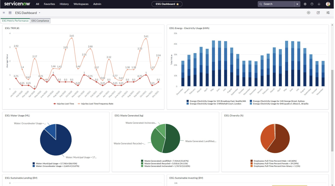
We began our research by visiting several successful ESG sites and exploring dashboard concepts online. From our research exploration and findings, we created a comparative analysis where we noted essential components to leverage in our design. Specifically, we compared the ESG sites from Salesforce and ServiceNow and looked on Dribble for UI inspiration in terms of how to create an intuitive learning experience.
Salesforce
ServiceNow
Observations
From our research and our client’s ask, we developed a Landing Page as well as a ESG Dashboard that would enable our client to monitor their ESG outputs in order to cut costs and reduce waste.
Landing Page Key Elements
ServiceNow highlighted their targets and internal use goals.
Salesforce broke down their waste into the specific metrics while our client emphasized their wanting to track electricity, energy, waste and water more generally.
ServiceNow provided an intuitive visual that allowed the user to see all the elements at once.
ServiceNow allowed the user to see the different outputs from the various offices, enabling them to know which offices needed to cut down on specific energy usages.
Dashboard Key Elements
ServiceNow broke down their energy goals further by having the goal and how they planned to get achieve the goal.
A site on Dribble had a specific contact for who was overseeing the office.
ServiceNow highlighted the drill down location and the emissions over the months instead of the more general years.


Analysis
Empathy Mapping
I led our design team and client through an empathy mapping brainstorm experience where we had the client (subject matter expert) identify their wants and needs for the site. This allowed us to more accurately deliver a design solution that allowed them to monitor their company’s ESG outputs. Understanding the differences between the client’s wants and needs allowed us to prioritize their needs and focus secondly on their wants.
Target User
We further collaborated with our client to identify their target user. They noted that each bank’s office supervisor would monitor each site and their supervisor. We specifically designed the ESG Landing Page and Dashboard in mind of these target users. The cient opted out of creating persona cards and instead went over the target users’ key goals as a list with using the site.
Design
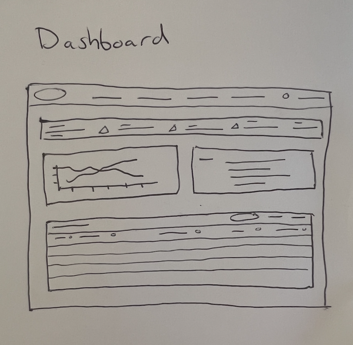
Low-Fidelity Wireframes
Before beginning the high-fidelity wireframe, I ideated quickly and sketched out various possible structures or ways of laying out the site to highlight the key elements the client emphasized.

High-Fidelity Wireframes
From a combination of research and collaborating with the client in the empathy mapping activity, we built out the following site pages that highlighted key ESG elements such as the overall waste. The flow also features the breakdown by location and type of waste over time.


Clickable Prototype
When creating this prototype I leveraged both my company’s and client’s style guides to create two different experiences with the same embedded components. When creating these components, my team used auto-layout in order to make the design responsive when resizing to meet the needs of various dashboard constraints.
Feedback
We conducted a survey after creating the prototype MVP to gain a deeper understanding of the client’s further needs and wants. Additionally gaining this feedback on the prototype was imperative as it required another depth of expertise in ESG. We targeted two kinds of user in the survey; we received feedback from those with no ESG knowledge as well as subject matter experts.
Survey
Did you find the ESG Landing Page and Dashboard intuitive?
Did the item drill down from viewing all the waste over time in multiple offices to the single office solve wanting to understand key data points?
Did the progression of breaking down various wastes alleviate confusion?
Did having an email with key office contact create a more streamlined communication experience?
Conclusion
Summary
Negative
3/6 users questioned the differences between the complete, on track and at risk in terms of what the numbers represented.
1/6 users questioned what would be searched in the drill down view and wanted a more specific explanation of this.
Positive
4/6 users found the landing page and dashboard intutive; one user highlighted that the images helped as well as the flow from overall summary to specific items and location.
1/6 users noted that the use of color for red being negative and green being positive helped her understand that there was improvement or lack of it.
Neutral
2/6 users noted that it would be nice to further see a flow in terms of how to set ESG goals.
1/6 users noted wanting further elements of gamification within the dashboard in terms of creating more engagement and possible competition between branches.
Next Steps
Conducting an in-depth usability testing on target users will allow user feedback that will further enable this product to rapidly iterate and improve.
Additionally, building out each ESG target goal into a list format will provide the users a more specific plan of how to achieve the goals.