Stress Monitoring App
for Tech Employees

The Problem
Tech employees struggled with productivity when faced with external stressful events.
The Client
The Accolades Group
My Role
I researched, designed and delivered a clickable prototype that helps individuals track and manage their stressors through a daily checkin.
Tools Used
Figma
Illustrator
Procreate
The Process
Research
Secondary Research
Observations
Analysis
Target Users
Re-mapping
Design
Lo-Fidelity Wireframes
High-Fidelity Wireframes
Clickable Prototypes
Feedback
Usability Testing
Takeaways
Conclusion
Summary
Next Steps
Research
Secondary Research
We began our research by visiting several successful emotional wellness apps and sites. I then went through and compared their information architecture and the sites’ key features that we could potentially leverage. Understanding key components within these apps and sites allowed our team to create a design solution that used a variety of successful innovative ideas.
Observations
Leverage-able Items from researching various stress related apps
Breath2Relax - the visual components and simplicity of the goals that show the user how to take it easy when the user feels overwhelmed.
Welltory - great visual simplicity to represent complicated UI elements that allows the user to track how their stress is affected by their habits.
Stress Scan - provides a relatable emoji cloud and allows the user to tag various items instead of writing them in to monitor their stress.
WhatsUp? - creates a streamlined platform that allows users to develop their coping skills and choose various techniques that help manage stress.
Samsung Health - provides clear visual graphs that enable the user to understand the underlying health components.
Inner Hour - creates a plan for how to improve one’s mental health that uses courses that provide deeper understandings on stress, anxiety and depression. Breaking down these categories into courses helps the user navigate and more successfully manage their emotions.


Analysis
Target Users
The client identified her goal in creating this app as “helping neurodiverse adults manage their stress an anxiety.” She aimed to specifically target those working in technology fields who sometimes struggle managing certain intense emotions. These individuals include those who struggle with depression, anxiety and autism who are between the ages of 30-60. Additionally, this app targeted those who had existing therapists and iphone data, as it helps pass on the users’ quantitative health data to allow therapists deeper insight into their patients’ habits.
Re-mapping
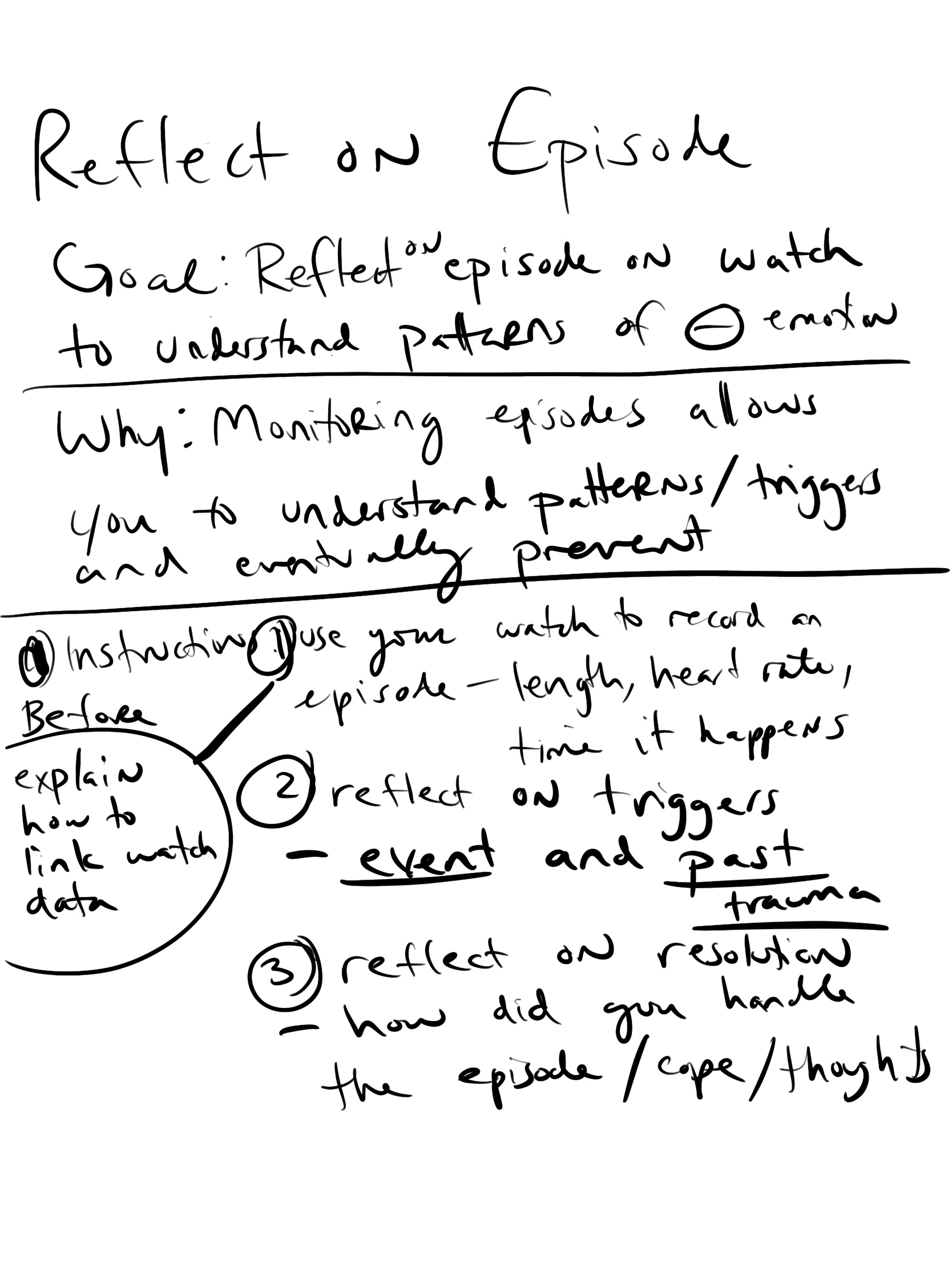
Prior to my joining the team, the client had worked on creating several flows with the developer though had lacked a consistent designer. They had a variety of pre-existing flows built with no central point as they had skipped several steps in the design process. The following re-mapping images I created to identify the central goals of the app in terms of how the app would function to empower those struggling with negative emotions.


Design
Low-Fidelity Wireframes
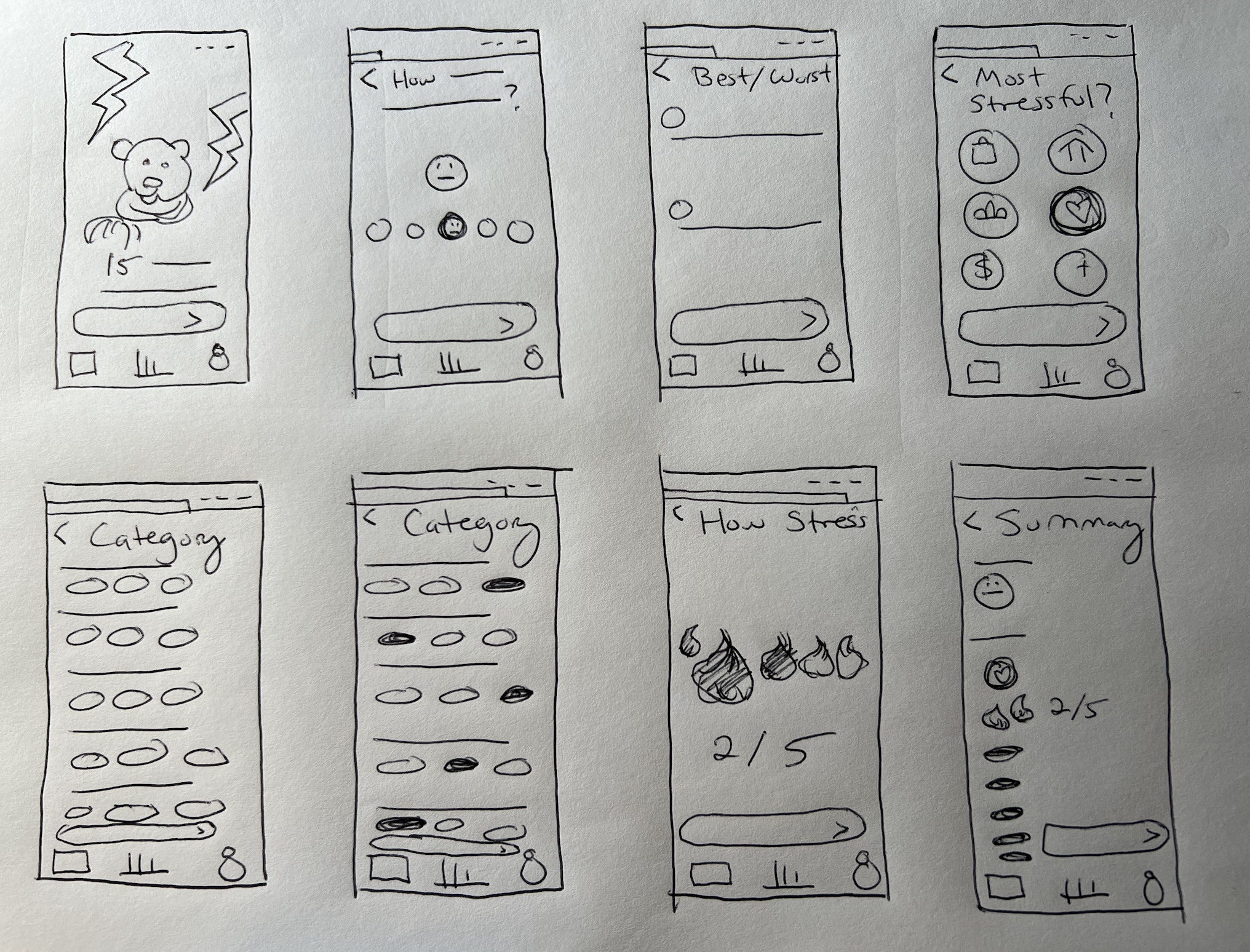
Ideating quickly with sketching prior to creating high-fidelity wireframes is essential in terms of brainstorming to later create the pixel-perfect and time-consuming high-fidelity user experience.
High-Fidelity Wireframes
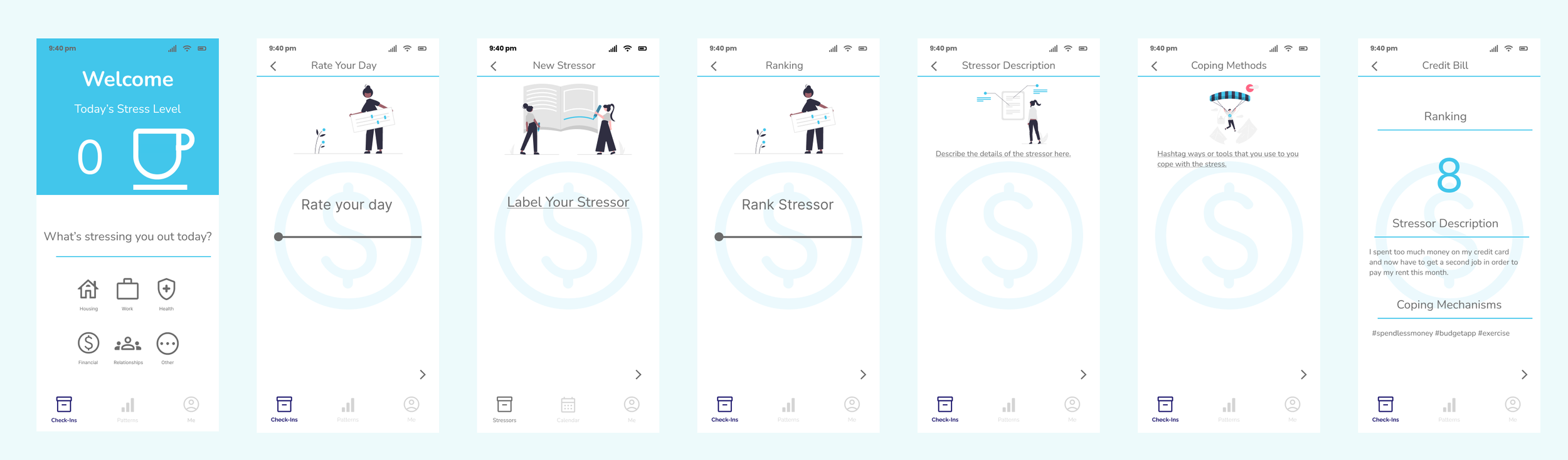
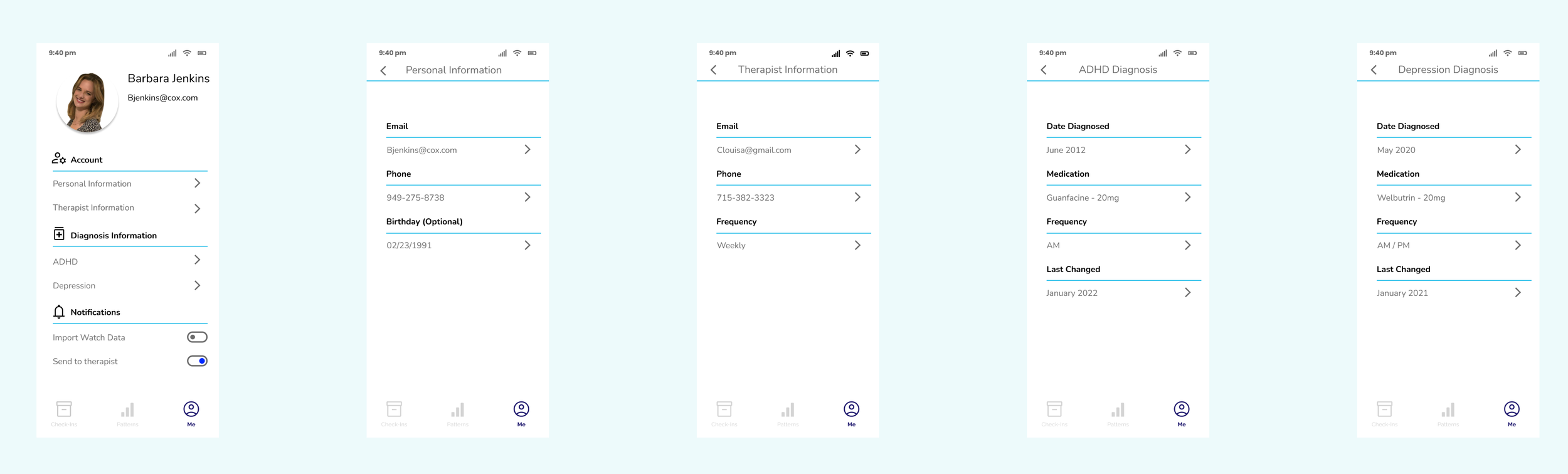
Based on research and the client’s needs and wants for the product, I mapped out the following wireframes. The first three flows were created prior to the usability testing and feedback. The second two flows were created post the usability testing and feedback.
Checkin Flow
Checkin Flow (Post Testing)

Progress Flow

Progress Flow (Post Testing)

Me Flow
Clickable Prototypes
Feedback
Usability Testing
I led our team in conducting usability testing on three target users. I led each user in a walk-through of the flows we needed feedback on and created questions that corresponded to the feedback needed making sure to not incorporate leading questions while doing so. I recorded these sessions with their permission and later broke their responses into “likes,” “dislikes” and “suggestions.”

Affinity Mapping

Conclusion
Likes
The ability to see a numerical value for typically qualitative emotional information.
That you can see what’s stressing you out, and that you can record it over time.
The ability to share the data directly with a therapist.
Summary
Dislikes
Does not understand the relevance of the water drop logo.
Was confused what the categories are and what they do.
Too many items to keep track of at once.
Confused by the calendar flow and how it corresponds to the app.
Next Steps
The developer built out the first prototype stage prior to the usability testing. The next step will be for him to update the app with the iterations from the testing. Further updating the app’s UI based on trends to create the best user experience.
Creating a pitch-deck to target mental health providers as they can incorporate the app’s use with their therapists, who can use it as a tool with their patients.
Suggestions
Create a graph flow instead of a calendar flow.
Create an easier way to select the various items on the list.
Get more specific feedback on each episode.
Make it a daily check-in so that the data remains consistent overtime.