Utility Solutions
for Disaster Preparedness
Utility Solutions
for Disaster Preparedness
The Problem
Emergency preparedness managers in the utility sector struggle to quickly understand when and how weather events will impact their assets. Existing products require multiple interactions (hovering and scrolling) to access critical data, slowing high-stakes decision-making during outages or severe weather.
Objectives & Goals
Improve accessibility of critical weather insights for utilities.
Reduce cognitive load and interactions required to view data.
Align UX and engineering with clear problem-to-solution documentation.
Support faster, more confident operational decisions.
Our Process


Partnered with weather product managers to identify pain points across weather-impacted industries and define problem statements per sector.
Mapped existing SIA utility product (WSO offering) to understand current data presentation and decision-making flow.
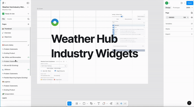
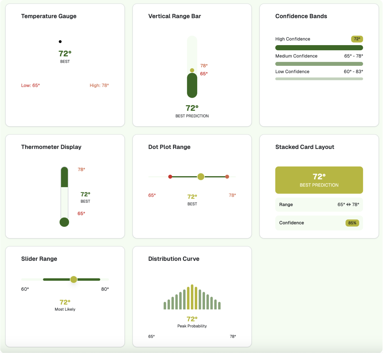
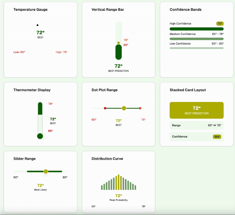
Used generative tools (V0) to explore alternative visualizations for “worst, best, and most likely” weather event outcomes.
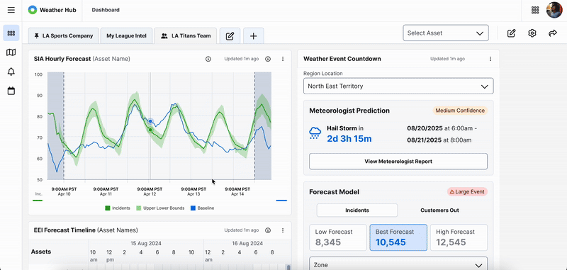
Created the Weather Event Countdown Widget to replace side drawers with a clean, accessible dashboard view. Iterated with product feedback to create a second version that improved clarity, accessibility, and reduced interaction errors.
Business Challenges
Fragmented product experiences across industries.
Overly complex data visualization in existing SIA drawer.
Need for consistency across new industry widgets.
Ensuring real-time accuracy and clarity under pressure.
Tight iteration cycles with multiple PMs and SMEs.
Product Users
Primary: Emergency Preparedness Managers
Secondary: Meteorologists, Operations Coordinators
These users need fast, visual clarity on weather timing, severity, and impact for effective resource deployment.
User Needs
Real-time, visual clarity of weather impact timing.
Simplified data interpretation (no hover required).
Accessible design for rapid, high-stakes decisions.
Consistency across dashboard widgets.
Quantitative Research
I worked with product managers to talk with utility customers and found they struggled with hover-based data and fragmented views, leading to a more accessible Weather Hub dashboard.
Observations
90% expressed preference for dashboard-integrated insights.
80% of utility managers rely on manual cross-checking between systems.
60% reported confusion from hover-based data interactions.
50% requested clearer visualization of uncertainty ranges.
30% noted time lost navigating between tabs.
Product User Challenges
Hover-based interactions slowed response time.
Misinterpretation of forecast ranges.
Fragmented workflow between products.
Lack of consistent design across widgets.
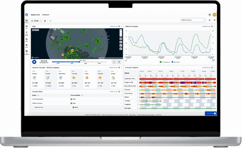
Existing Product
Existing SIA Drawer
Key Items
Features: Hover-based insights, side-drawer access
Limitations: High interaction cost, poor visibility under pressure
Unique Features
Unified widget design across industries.
Non-interactive data visualization improving accessibility.
Dashboard-first experience replacing fragmented side drawers.
Alignment of UX, PM, and engineering from problem to delivery.
User Persona
John David
Emergency Preparedness Manager
Description
A day in their life
Balances monitoring multiple data systems, planning resource allocation, and communicating updates during storms.
Pain points
Data overload from multiple tools
Hover/scroll fatigue
Lack of clarity in risk scenarios
"I just need to see the impact of a storm clearly, without digging through multiple screens or hovering over data."
Important
Not Important
Urgent
Improve data clarity before next storm cycle
Fix hover-based interactions slowing decisions
Ensure key asset locations are visible in countdown
Reduce color palette inconsistencies
Minor icon adjustments
Adjust font weights across non-critical screens
Not Urgent
Standardize dashboard layout across widgets
Update copy for consistency in alerts
Optimize minor visual spacing issues
Add extra animation for less-critical visuals
Minor icon adjustments
Adjust font weights across non-critical screens